


Read The Bleepin’ Manual
The Thing You Scribble On

The doccyment tab lets you tweak how each song looks—low light mode, tint color, fonts, paper size, margins, basically all the visual stuff that makes you feel less like you're squinting at a potato.
Tweaky Bits
Tap that wrench icon in the corner & you can go ham on global system settings for how this menu acts. Spoiler: this doesn't touch your per-song formatting. Sorry not sorry.
Tint Mode
This determines what colors OnSong uses to paint your song on the screen. Helps when you're squinting in the sun, or if bright screens make your eyeballs sad. These modes play nice with Low Light Mode. No selection? OnSong defaults to being boring. Your options:
- Paper — high contrast black & white. Very "I printed this in 1995."
- Dim — like paper but less aggressive. For people who like their contrast medium-rare.
- Sepia — dim but make it warm & cozy. Think old grandma photos.
- Sky — blue tint overlay to chill out your eyeballs if screens stress you out.
Low Light Mode
Right next to the mode buttons is an icon to toggle low light mode system-wide. Flip it & watch it cascade to every song & menu in OnSong like a sad digital domino. Yes, it affects your tint mode too.
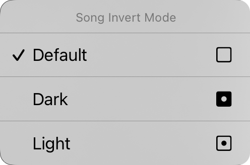
Tap & hold that low light button & up pops the Song Invert Mode context menu. Wanna force ONE song to stay light or dark no matter what the app is doing? Do it here. Default is "default" (genius, right?) which means the song just vibes with whatever the system's doing.
Font Family
Five buttons at the top let you pick a font for your whole song. Live your best life:
- Sans-Serif — like Helvetica, perfect for chord charts. The safe choice. Default.
- Serif — like Georgia, maybe easier on some peepers.
- Handwritten — like Marker, skinny font, fits more stuff. Chaotic good.
- Monospaced — fixed-width like Courier, helpful if you're into that alignment life.
- Custom — ellipsis button to browse your device's fonts like you're shopping for drip. Each tap brings back the Custom Font screen. You're welcome.
Line Spacing
Wanna cram more onto your screen? Squish the line spacing. Want room to breathe? Expand it. Tap the icons left & right of the sliders to dial it in. Range: 0.7 to 1.3 lines. Default: 1.0 (the Goldilocks zone).
Paper
Set your virtual page size, which nukes your font size. Bigger paper = smaller fonts. Shocking, we know. Those icons on the right flip between portrait & landscape like you're spinning a lazy Susan.
Layout
This section controls how your document outputs when you're using the R2 Rendering Engine. Three controls to obsess over:
Pagination
Scrolling continuous sheet or chunked into virtual pages? Your call. We don't judge.
Columns
Pick one or two columns. Two columns? Your song flows to the other half like it's making a grand entrance.
Gutter
That's the space between columns. Pick anywhere from 0" to 1" in 1/16" chunks. Very precise. Very extra.
Margins
Inset your virtual paper edges so text doesn't suffocate. Useful for Hot Corners or Navigation Zones if you're into that section selection vibe. Icon on the right shows which margin got spicy: left, right, top, or bottom.
Footer
Make the footer a percentage of your lyrics font size. Toggle it on & off with the button. Riveting stuff.
Everything on this tab except low light mode applies to your selected song. Want to apply it everywhere? Buckle up, we'll get there.
Pro tip: Tap that wrench icon to access Style Preferences Document & change all the defaults. Make OnSong bend to YOUR will for once.


